Building Charts With CSS
These days, I'm working a lot on the WordPress theme of my blog. This weekend I made some charts for the archive page to make it a bit more visually appealing.
But first, I have to give credit to the people that are building Charts.css. My initial plan was actually to "just use it" and that worked quite well until I discovered that the length of the names of my categories is enormous and breakes everything in situations with smaller screens. After adding some custom CSS to solve the problem, it turned out that I was more fighting against the framework as that I was really using it. So I gave up fighting and made my own, less flexible, implementation. But I'm definitely looking forward to using the framework in the future.
Adding the charts to WordPress wasn't that complicated: It brings its own Gutenberg blocks for category overviews and monthy archives, so I registered a new block style and hooked myself into the rendering function. After getting some additional information and reordering some data, I was good to go.
Then I wrote some CSS to display the contents of a table as bars or pillars. It's not much: Just about 130 lines of code. The idea is simple and shamelessly borrowed by Charts.css: There's a table with a label as th and a number as td. HTML sets the semantic markup, while CSS takes care of the visual representation. I've added some gradient and some links, done. Since I already had some JavaScript available that sets a CSS-Class when the content is intersecting, animating the bars of the charts was a breeze.
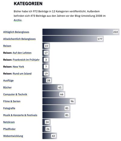
For displaying the categories with their rather long names, I've chosen a bar chart to display the amount of posts. I'm not quite sure if I should summarize the posts in the category "Reisen" ("Travels") and its children. I think that's fine for now.
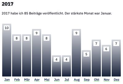
I've chosen a pillar style representation of the amount of posts for my yearly overview, since the bar chart got a bit long with twelve entries for each year. Unfortunately, the pillars did not quite fit on smaller screens so I had to go for bars there as well.
You can see those on the archive page of my german blog "der tag und ich". I'm pretty happy with the outcome of the weekend and already thinking of other possible statistics that I could visualize.
